Follow @tinyrexwrecks

Sunday 26 February 2017

Pigeon P.I. cover

My second picture book is publishing this week so here's a post about how the front cover was made.  Don't worry, I've spared you the gazillion colour choice screenshots I took!


Back covers are one of my favourite parts of a book.  They have all the fun of the front cover with none of the responsibility.  I usually leave the back cover until the very end and so far they've always been great fun to do.

The back cover means more room for silly jokes and shenanigans.  


For me, the front cover is the hardest part of any book I make because it's the first thing that people see.  It has to invite readers in and tell them a little bit about what they'll get inside but not everything.   You want people to want to pick it up, to be able to see it across a room and equally to be able to read it when it's tiny on their computer screen.   This is probably the part of the book that my art director and I spend most time discussing, sending ideas back and forth, usually over a period of a few days, refining as we go. 

This was an early idea we had but it never made it any further.  We wanted to make sure we introduced both Murray and Vee (pigeon and canary respectively) and also had a little bit of a narrative.  I particularly liked how Vee's shadow put her on the poster beside Murray, foreshadowing things to come.  I forget why we chose not to use it, but I still like it.

Here are some sketch ideas.  I tend to send every little doodle.  I find that drawings I'm not sure about can often spark ideas in other people and we can end up using them for something somewhere.

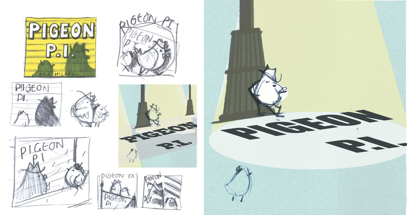
This was the sketch we thought worked best as an idea.


This image made its way onto the case cover beneath the dust jacket.

Some more ideas for the cover, case cover and a few fonts I liked.


We tweaked the image a few more times to make it into this.  We wanted to keep the noir feel and the implication of danger whilst showing through Vee that this would also be a really fun, silly book too.


The hardest part of this cover was the font.  Compared to Life Is Magic this looked like quite a simple book lettering-wise.  But with five separate character fonts, the background posters and adverts plus my simple* endpapers, there ended up being a lot more. 


(*My endpapers were simple.  I wrote this in an email to my editor.  I forget how simple they were, but at some point I had a great idea which turned out beautifully and was by no means simple after all.)

Anyway, the cover went through several rounds of hand-lettering.  I do a lot of typography for someone who is still very much learning as I go, so my way in is a little like that part in The Shining where Jack Nicholson is typing 'All work and no play make Jack a dull boy' over and over.  Like so...


Once I see something I like I'll do my best to refine it.  We actually settled on a font, a perfectly nice one, but decided it wasn't strong enough.


Back to the drawing board one more time and we cracked it.  I'm so glad we re-did it.  The final lettering turned out really nicely, especially with the shiny gold foil finish.


So shiny!


Pigeon P.I. publishes on March 2nd.


Monday 20 February 2017

Making Pigeon P.I.

Since my second picture book Pigeon P.I. is published in but two weeks, I thought I'd put together a little how-it-was-made.

Pigeon P.I. started life as a flash of inspiration.  I was working on ideas for my second book and I already had a pretty good one.  I wasn't sure if it was THE idea but I liked it.  With about a week to go before my meeting at Andersen Press I had an idea I was far more excited about: I was going to write a film noir picture book and call it Pigeon P.I.  It sounds so simple when you say it out loud but ideas are like that, they're exciting and instant.  It takes a lot of work to make them into something more.

Is it a mystery?  The words 'private investigator' should've been my first clue.


I started to draw using Humphrey Bogart as inspiration for Murray, my pigeon (apologies to Mr. Bogart)

The first Murray.  Sadly, 'you filthy corn husk' didn't make it in.


Faye Dunaway from 'Bonnie and Clyde' helped inspire my canary Vee.  Apologies to Ms. Dunaway but I wanted someone who looked great in hats and there's no denying that she does.

First sketch of Vee

One of many test drawings of Vee

A few more tests.  My art director Beccy and I spent a long time working on what made Vee look young and appealing.  We shortened her hair flick and really focused on her shape.   She was definitely the hardest character to get right.  


The final Vee


I didn't have a story yet but I had most of the characters and a world I wanted to build.  Most importantly I had an idea I was passionate about.  It was THE idea.  Here's some of the sketches I prepared for my meeting.


I make a lot of notes.


This neon colour test didn't make it in but I still like it.


 I was watching Chinatown at this point.


From the final book.

A little joke about a spin-off series


Take a peek under the dust jacket to meet Penguin P.I.
First sketch of the police, who nearly didn't make it when my first draft came in at 50 pages

Sadly the night watch don't feature.  They're biding their time.


 Luckily, the good folks at Andersen Press liked this idea too and we spent our meeting discussing character motivations and all things noir.  With all sorts of wisdom imparted, off I went to sit with my sketchbook to see if these characters really had a story to tell.  It's funny to look back and see how many stages a book goes through when you write it.

This pie-as-an-escape plan is one of my favourite drawings that never went anywhere

It's also amazing to see how much sticks.  One of my very first drawings has remained the whole way through as my first page, with pretty much the same first line.


Only I could think a pile of abandoned newspaper is a 'filing system'

Murray and his filing system


I'm pretty excited about the way this book turned out, it's very different to Life Is Magic but I think they've got some things in common, namely an excess of hand-lettering and background characters.

A note to myself


What I wanted to create was a satisfying mystery in picture book form, to pay homage to the detective books I've loved all my life but to make sure that I was writing it for a picture book audience, that this was a satisfying world and story in itself and not just a parody of something I loved.  I hope I've managed to do that.

Sunday 12 February 2017

Wednesday 8 February 2017

Waterstones Children's Book Prize 2017

I'm really excited to announce that Life Is Magic has been shortlisted for the Waterstones Children's Book Prize 2017 in the Best Illustrated category alongside five other brilliant books.  Huge congratulations all,  especially fellow MA Children's Book Illustration graduates Fabi Santiago and Matt Robertson.

Published by those lovely people at Andersen Press now is a good time to thank my editor and art director, Libby and Beccy, who are both fantastic at what they do and brilliant people to work with.  They really helped make this book into the best version of itself.  My lovely agent Helen also deserves a big thank you for helping shape the very first draft into something that was worth putting on a publisher's desk.   This book wouldn't exist without them.

To celebrate there's a jaunty red-lettered cover.


You can read all about the prize and see the full shortlists for every category here.
Congratulations everyone!

Thursday 2 February 2017

Life Is Magic Paperback!

Life is Magic is out now in paperback for those who like a book with a little more bend.  Hooray!

Can you spot the cover differences from the hardback?

Here's a peek at the insides...

Tadaa!


This is Gary.  


Some magic in action.


There's now a jaunty 'This book belongs to...' page where you can write your name or whatever takes your fancy.  And the clever clogs' at Andersen Press have managed to squeeze all the additional cover artwork in too.

Available in all good bookshops and the usual places online.

I've also recently been sent a few co-editions so if you're in the U.S.A look out for Rabbit Magic.


In French we have 'Tout est Magie' (which I had a lot of fun hand lettering)


and in Danish look for 'Livet er Magisk'